The Psychology of Fonts: Why Your Brand’s Typography Matters
When most people think about branding, they picture logos, colours, or maybe even a catchy tagline. Fonts don’t usually top the list. But they should.
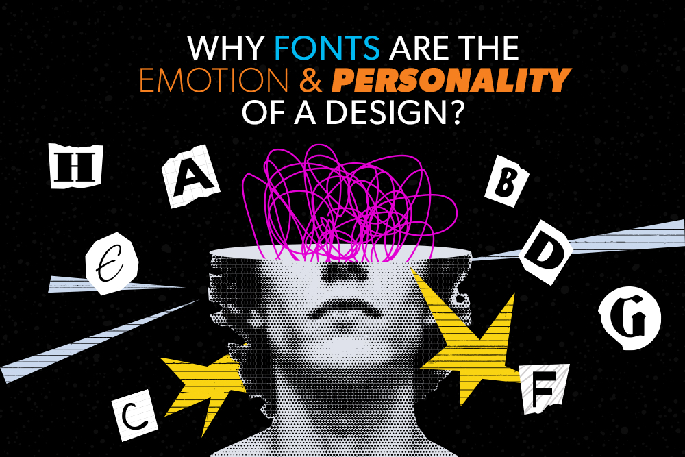
Typography influences how we feel, how we think, and even how we behave. The typefaces you choose aren’t just a design detail. They’re part of your brand’s voice. They quietly communicate whether you’re trustworthy, approachable, quirky, or bold.
Here’s what they’re saying:
Every font family carries its own personality…
Each choice tells a story about your brand and the impression you want to leave.
Fonts do more than set tone. They also affect how easy or difficult it is to read content. This concept, known as cognitive load, refers to the mental effort required to process information. Fonts like Georgia or Times New Roman in print, or Roboto and Open Sans online, are considered low cognitive load typefaces. They make reading effortless, allowing your audience to focus on the message rather than decoding the text.
In contrast, ornate scripts or heavily stylized fonts such as Blackletter or Jokerman create high cognitive load. They can be visually interesting, but they slow readers down and increase mental strain. When reading becomes too difficult, people are more likely to disengage, no matter how strong the content is. In today’s fast-paced world, minimizing cognitive load is essential for keeping your audience engaged.
Readability is just one part of how typography influences perception. Fonts also communicate personality, and this extends to the person or brand behind the content. Research shows that the “personality” of a typeface directly impacts the perceived personality of a document. Readers notice when a font feels out of place, and their perception of the content and its creator can change accordingly.
Using an appropriate or neutral typeface helps readers view the message and its author positively. The content feels professional, thoughtful, and credible. Conversely, a font that clashes with context (think playful script in a formal report) can undermine trust and distract from your message. Choosing the right typeface isn’t just an aesthetic decision; it’s credibility that supports the story you want to tell.
Of course, fonts don’t work alone. The colours you pair with them can amplify (or soften) the impression they give. Essentially, colour adds another layer of meaning. Think about how these shades shape perception:
Pairing fonts and colours strategically can create a powerful shorthand…telling your audience who you are before they’ve even read a word.
Fonts may be quiet, but they’re powerful…and at TDG, we know how to make them talk. Whether your brand needs bold, playful, professional, or approachable, we’ll help you find the typeface that fits just right.
We love fonts a little too much (seriously, we have favourites), and we’re here to help you pick the ones that bring your brand’s personality to life.